Responsive Website Design
Responsive Website Design is a modern approach to the ever-changing world of devices that can browse a website. Computers, desktops, laptops, tablets, ereaders, and smartphones all want to look at your website, yet all have different screen sizes.
So how do you determine what size to make your website and how to present to your audience when you don't know what size screen they'll be using?
Also, what about tomorrow? What new gadget or device will be brought out next week and what size screen will that have? Surely you don't have to redesign your website again?
Responsive Website Design caters for all of this · It calculates the screen size of your device and delivers a website that looks great no matter what size device you are using.
Your Responsive Website Design
Responsive website design appears simple; there is only one version of your website, and it is designed to “respond” to whatever device you are viewing it on. In most cases, large images that are not necessary on small screens and will reduce in size or sometimes disappear completely. Textual content, pages, articles, and other elements on the page will neatly stack themselves on top of one another to accommodate the screen you are viewing it on.
So your website can now be viewed on any device. You need to decide how you want each section of each page to be displayed. How you want to stack each section on smaller screens, and if some elements maybe even get removed on smaller screens where it would add to the clutter.
The Difference between Responsive and Mobile Websites
Mobile websites were very popular once, and everyone thought that they were the future of website design. This hasn't proven to be the case with different manufacturers all providing different screen resolutions for their devices. Then tablet computers came onto the scene (mainly the iPad) and then mini-tablets to confuse designers even more. There are new devices with different screen sizes almost every week.
This is when mobile websites died and responsive websites took over. Mobile websites usually target a specific screen size only, or even worse, a specific phone. They couldn't adapt to the future, and you'd sometimes need to manage multiple websites at once.
Responsive websites take all this in their stride. They look at the size of the screen that they are being used by and adapt to it. There is only one website, and it's flexible enough to be future-proof as well. Responsive websites are not mobile websites, they are so much more, so much better and the right way to design a website.
Since 2015 more people use smartphones and tablets to view websites than traditional laptop and desktop computers
To make it easier for people to find the information that they’re looking for, Google have added a “mobile-friendly” label to all of their mobile search results. So if you are doing a Google search on a mobile device, then you naturally want to get mobile-ready websites at the top of the search results.
That naturally has implications that NON-Mobile Friendly websites will NOT be at the top of mobile search results. Think about that for a minute. If your website is not mobile-friendly, then you have less chance of being found by your potential customers.
A website or page is eligible for the “mobile-friendly” label if it meets the following criteria as detected by Googlebot:
- Avoids software that is not common on mobile devices, like Adobe Flash
- Uses text that is readable without zooming
- Sizes content to the screen so users don't have to scroll horizontally or zoom
- Places links far enough apart so that the correct one can be easily tapped
Take the Google test to see how your website scores
Why you MUST have a Responsive Website
Laptops and Desktops
Desktop computers and most modern laptops have wide format screens that can accommodate an entire website in full. The website needs to look good on these larger screens and make use of all the available screen real estate.
Websites can be more graphical in appearance and more feature-rich to immerse the online visitor into the site content.
Tablets and Notebooks
Giving your website an interactive feature helps your visitors engage with your website. eCommerce, booking systems, quote systems, order management are all examples of this.
What can we add to your website?
Smartphones and Mobiles
Smartphones and Mobiles have taken over the way people browse your website. They can change orientation (landscape and portrait), are browsed with the tip of a finger, and content delivery needs to be fast and efficient.
Whilst they can be feature-rich, their content may be reduced to remove on-screen clutter and to make for a cleaner website on a smaller screen.
Take a look at some of our recent responsive website designs
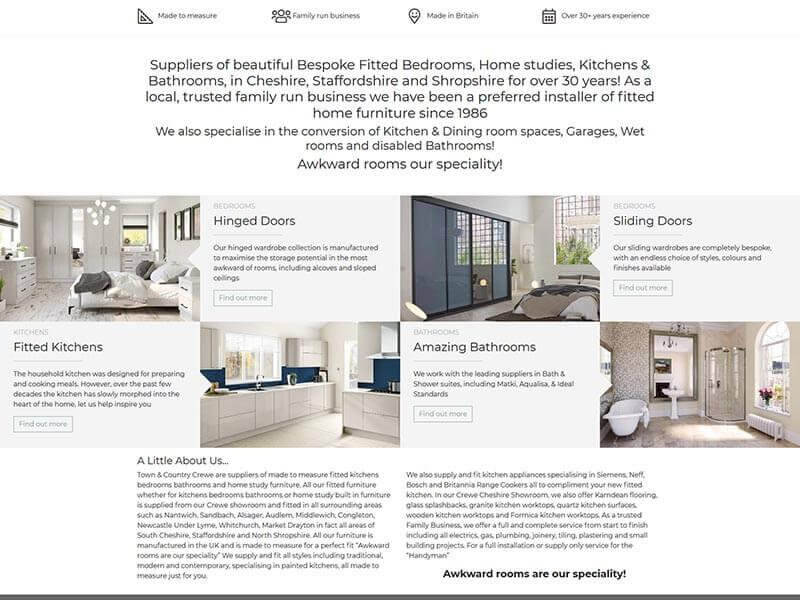
Here are just a few examples of some of our most recent responsive website design
work.
View our entire
portfolio, or select one of the websites below for more information about that particular
responsive website.


